After months of waiting, and then later weeks of watching jealously as fellow Twimbos enjoy the new Twitter profile design on the web, the design is finally rolling out to us mere mortals. Today, on loading Twitter on the web, I was greeted with the following message:  And take a look I did. And please I was what I saw.
Yes, it does feel like the generic Facebook, Google+, Yookos etc.. profile, but that’s not a bad thing. In fact it means more familiarity, and less contempt from newcomers to the Twitter that are looking to find the usefulness of the platform.
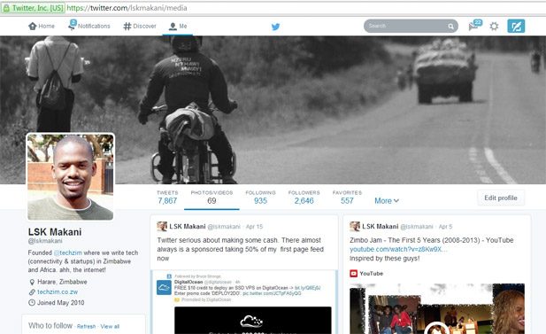
Here’s screenshot of my new profile:

So what has changed? The following:
- Now you can pin one of your tweets right at the top of your profile. Apparently so those that see your profile “know what you’re all about”.
- Twitter says your best tweets (those that have had the most engagement) will show in slightly larger font.
- It shows how many tweets you have favourited so someone can click on that too see the kind of stuff you’re liking.
The Facebookness of the new Twitter shows especially when viewing the a user’s media feed. Apart from the profile view, the rest of Twitter remains largely unchanged.
If for some reasons, Twitter hasn’t prompted you to try the new profile, you can do that yourself here.


I tried it out and it’s brimming with improvements.