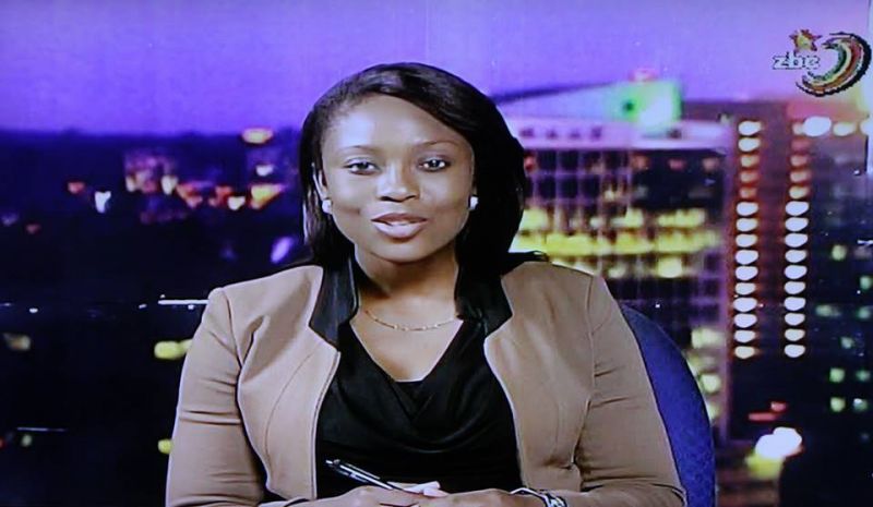
So here I am relaxing on the sofa catching up on some ZBC News last week and lo behold, the news room/studio has no table!! Moreover Miss News Lady is standing there reading me the news from a tablet! What did I just see?!
Yes the presentation of news was a little bit different and I was skeptical as to if Miss News Lady can stay standing for the whole news hour. Spoiler alert, an hour is quite a long time for one to be standing so no. However the improvements don’t stop there. Let me start it off with some background…literally and figuratively.
So a couple of weeks ago we had a news desk with a nice panoramic wallpaper of the Harare city skyline at night making up the background. 2 issues I had with it. The first is it was a tad bit glossy and so poorly placed lighting gave off a reflection that ruined the aesthetic.
Secondly it was a pretty low res wallpaper, not that it was too bad considering the ZBC feed has not yet caught up to HD resolution but since I’m into photography and filming so it all could be nit picking. Then again I have seen billboards with lovely resolution in the city streets so there is that.
Now however they recently updated their news room and that sub par background was replaced by a fancy green screen. Well how about that, from a crummy old wallpaper to some CGI. What a jump right?
I have to say for a moment I was actually proud. Finally they have decided to get the ball rolling and add a better aesthetic to the 8pm prime time news. Do something a bit differently. The desk came back though for obvious reasons so Miss news lady can be more comfortable but also because it’s less of an editing headache the less movement the moving subject makes.
With every new adoption of technology it is a learning curve. Version 1 is never perfect but it’s the perfect place to start pursuing perfection. What an embarrassment it was to see our national news room with a wallpaper that’s literally peeling off the wall. Surely we could do better than that and that’s exactly what the engineers at ZBC studios thought too. Kudos to the green screen and the tablets. The digital push is quite the refreshing step taken on by ZBC. A small step but quite an important one for the national broadcaster.
P.S Also look into finding/creating a CGI background that is less loud. The one that’s there just has too many things going on. With respect to the erratic variances in volume well that’s one for a different day.




Comments
2 responses
Pictures to go with your report would be nice…
Yes I noticed that as well and wondered, do these ZBC people ever do pilot/dry runs before going live? if so, how many and for how long? do they do a focus group to glean insights and gather vital feedback before the nation is exposed to the “new” look?
We got tired of the “link up” with Montrose Studios, which half the time, never materialised. Ah guys!!
Coming back to the Green screen, you cannot be seen to be changing the background picture because you woke up feeling blue! Identify the picture or montage you want and stick with it!!! That is what branding is all about.