I remember when I opened my CBZ account. It wasn’t the best of experiences, I was frustrated to the point of almost choosing another bank. That all changed when I opened the CBZ Touch app.
I burst out laughing. I couldn’t believe my eyes. ‘Good one Cibby,’ I thought. I needed the comic relief.
The app was just hideous, there’s no sugarcoating it. That it was the official app of the largest bank in the country was mind boggling to me.
The fact that it was the most popular banking app infuriated me. The initial impression of banking apps for most Zimbabweans was going to be this monstrosity. What a way to lower the bar.
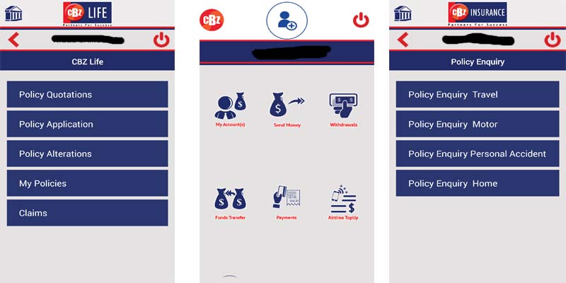
For those that never saw it, I’m sorry but my apps auto update, so I no longer have screenshots but below is a tweet I sent out.
To this day I don’t know how the developers got the decision makers to sign off on that design. The icons seem to have been drawn by a toddler, probably the CTO’s son. Maybe that’s how it got the green light. The overall design screams, ‘bare minimum.’
After I tweeted the above, they replied, ‘Worry not Learnhard, watch the space.’ I watched that space for one year and six months. Now I finally have something to report.
The new design is better, not great
If the directive given to the developer’s was to improve the design, that was no directive at all. There was no way to go but up. So, of course, the new design is better than the old one. See for yourself.
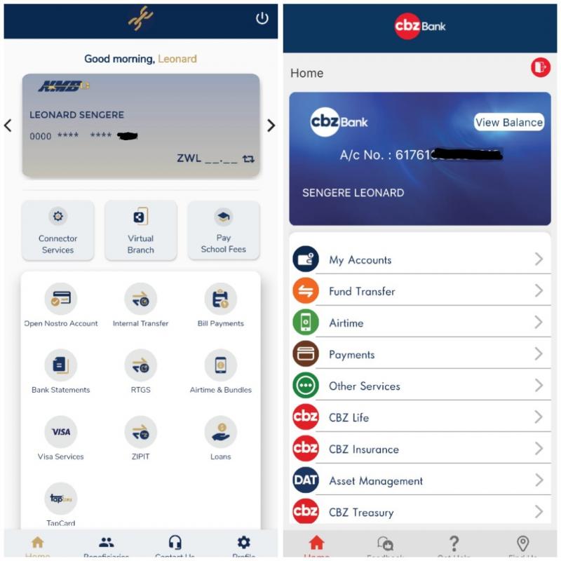
Turns out whilst I watched the CBZ space, NMB further improved their app. You can clearly see how the NMB design is just better, objectively.
The icons on Cibby’s offering look a little cartoonish. They also went overboard with the colours, the rainbow seems disjointed and jarring.
Contrast with the icons on the National Mattress Bank one and the difference is night and day. Here the icons were designed to work together with the same colour pallette. It just looks cohesive.
Further, I think the grid on the NMB app works better than the vertical alignment on Cibby’s. They could both chip away at the massive foreheads (headers) their apps have, with Cibby’s much too big.
Does all this even matter if the app works?
Yes, absolutely. Design matters. Both for physical items and software.
Humans are drawn to beautiful things. A beautiful face can mask a multitude of imperfections. Humans are just wired that way.
An ugly user interface conjures up images of incompetence, apathy and unlikeability.
If someone stepped on your shoes, your reaction is totally dependent on what they look like. If it’s an attractive person, truth is you are more likely to apologies yourself than throw a fit.
Same goes for UI design. If some feature does not work or an app crashes, you are more forgiving when it’s a beautifully designed program. You assume something went wrong, not that the program just doesn’t work. Which is what you assume when low level of care is betrayed by bad design.
The perception people have of a brand is important to it’s success. We see how Apple has leveraged good design into higher brand loyalty which in turn leads to higher margins.
Zimbabwean companies have to start taking UI design seriously. I’m glad CBZ has improved their offering and should continue improving it.
Now, first place on the ugly interface ranking goes to Buddy Beatz. Here’s hoping something happens there as well.










Comments
12 responses
MONTH OLD NEWS, how is it in August 2021?
Do the features work properly? I believe in function before form. NMBs may, debatably, look better but, it was annoying to use. You ended up just using online banking instead.
Users are frustrated by errors and usability regardless of how the app looks. The first impressions of a beautiful app quicky fade as users engage in the features they need.
Its very good i have to say. It very user friendly
Guys FBC vs CBZ where’s your money on in terms of banking ? I need to open an account with either of them.
I hear there’s a big meager brewing
Look who finally updated their CBZ Touch app😂😂😂. This thing came out a long time ago.
The new interface is certainly better, after all you said it yourself, they could only go up. That previous affair was a mess.
The new app lacks critical features like it doesn’t support copy and paste.
The new CBZ app is nice but extremely slow. It’s marginally better when on WiFi but if you’re using their zero-rate on mobile, better have some serious patience.
What is the post price at your site
send me more sites
let me know
What happened Biometric security?i be happy if i can pay my Zol bills….kindly look into that
Design matters people It matters
The UI is still not that great. Just look at the link like image on the first picture, it’s clearly shows that they didn’t wholeheartedly create their app. Otherwise being Zimbabwe’s best bank but having a bad app simply has no meaning