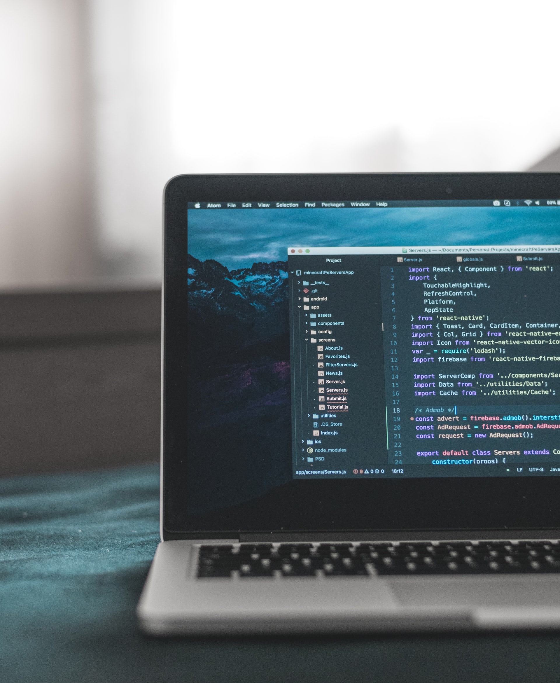
I don’t know what it is, but light text on a dark background just does it for me. As the dark mode fever has really reached fever pitch in the past couple of years, I’ve been one happy bunny.
Sometimes called night mode, this option of displaying content on a screen is my go to whenever available.
My phone (still running Android 10 unfortunately) rocks night mode 24 hours a day. My computer (destined to die on Windows 10) has been on dark mode since the day they gave us the option.
Same goes for all browsers, websites or apps. If it’s there, it’s gonna be on. Just like the newly released dark mode for Google Search on the web. It was on before they released it.
Being a fanboy, I want it everywhere but alas, it’s still pretty much 50/50 in availability. Why though? Demand is clearly high.
Allow this non-coder to explain to other non-coders why that is.
Dark mode not easy to implement
As a fanboy who is no coder, I often wondered why it took so long to implement it. In my head it was easy, just change the background to black, the text to white and boom, dark mode is born.
Turns out it can be quite the task. We saw how long WhatsApp, Facebook, Microsoft and many other huge companies took to implement it.
User interface tweaks
I knew, of course, that text which was black would have to be changed to a lighter hue. The goal after all is to maintain a good contrast. Everything has to be easy to read.
However, I overlooked headers, icons, illustrations and other UI elements which take longer to tweak. Every element that needs to change with the theme will need tweaking (writing CSS for a website for example.)
Oftentimes, the UI libraries of the system being developed for can be limited. Leading developers to re-implement their UI.
Flat icons are not too much of a hassle to change. It is animations and multicolored graphics that take time to tweak. Each one having to be amended to look good on a dark background.
It’s as good as starting over from the beginning.
User interface and user experience experts will have to redesign the whole app/ website looking for the suitable combinations of dark, saturated backgrounds and the accent colours.
Dark mode has to be an option
If the design team decides that dark mode will be the only mode that lessens the load a little. However, not all are fans and so light mode has to remain as an option and even as default in most cases.
This is based on science. There are reports that show that dark mode in a brightly lit environment causes eye strain, more than light mode. So, both light and dark modes should coexist. This adds complexity to the developer’s life.
They have to make sure any changes made do not break the light mode. What this means is that they are forced to design two user interfaces at once.
For multiplatform apps or websites this adds a lot of time to the development work. Imagine testing updates to an app on different OS and hardware configurations. Dark mode doubles the load.
The need for dark mode to be an option introduces a complexity to websites which is frustrating. For example, the issue of Server-Side Rendering means the preference for either dark/light mode is stored on the client side.
So, clever hacks are needed so that the dark/light preferences stored on the users device are accessed so that rendering can happen on the server side seamlessly.
In closing
There’s a lot more to the story than what we’ve talked about here. However, the gist of it is that, often, implementing dark mode requires rewriting the user interface completely. That’s why it takes so long to get the sweet darkness.

Comments
2 responses
Is it available on this website (techzim.co.zw)? 🤔 Can’t seem to find where to turn it on
Only works with samsung internet. Just enable dark mode for websites without a dark mode.